

Waterfall Chart is one of the Excel charts that are available in Excel 2016. Waterfall Chart also is known as Bridge charts or Bridge Graph or Stock Chart. This chart provides a quick view of positive and negative values over a period of time. Some waterfall charts connect between the columns to make the chart look like a bridge while the other leaves the columns floating.
A waterfall chart is helpful while visualizing large amounts of data. You can use a Waterfall chart while evaluating profits, Comparing earning, Keep track of inventory, Demonstrating cost changes over a period of time, etc. The features of the Waterfall chart are Floating Columns, Spacers, Connector Lines, Color Coding, Crossover.
Waterfall charts are mainly used by large industries, big companies. They keep track of the present performance of the employees or the workers. Waterfall charts are simple formats that present data in an impacting manner.
Waterfall charts are easy to make and understand but they face few challenges as well. Some of the challenges are: there are a lot of unnecessary data on the chart, you cannot create a vertical excel waterfall chart, do not allow subtotals.
Creating a Waterfall Chart in Excel 2016 is easy because it is in-built, however for creating a waterfall chart in Excel 2013 or earlier version you need to follow a few steps:
Waterfall Chart Excel 2013
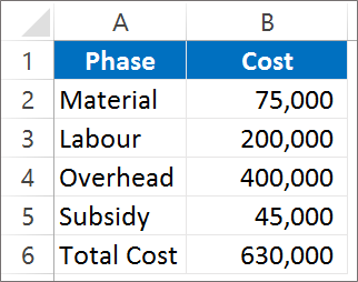
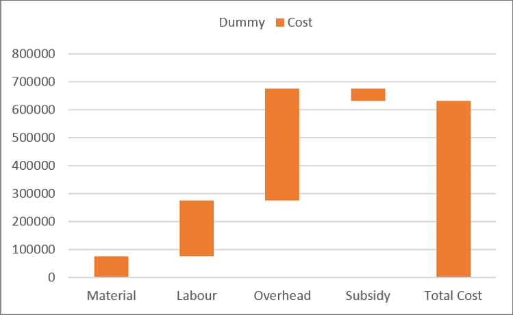
Step 1: Create a simple table with positive and negative values. Here in our example Subsidy will be deducted as it is provided by the government.
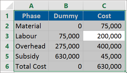
Step 2: Create a dummy column
1. For the Material phase we do not need a base as it is the starting column in the chart. So here the dummy column will be 0.
2. For labor the dummy column will show 75000 as we need to add 200000 above 75000. So the gap between the Horizontal axis and the column would be 75000 when we have to add to the total cost.
3. For Overhead the gap will be 275000 we will add 400000 above 275000.
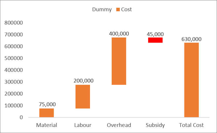
4. For Subsidy the gap will decrease to 630000 as it is provided by the government and we need to deduct it from the total cost.
5. Total cost is the column which is seen after adding or subtracting the various phases. The total cost column won’t be floating.
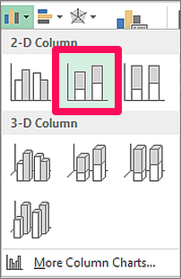
Step 3: Select the dummy column along with the cost and Phase column.
Step 4: Insert a Stacked column chart for the table selected. Click on Insert and in the Chart Group Selected Stacked column from the column chart dropdown.
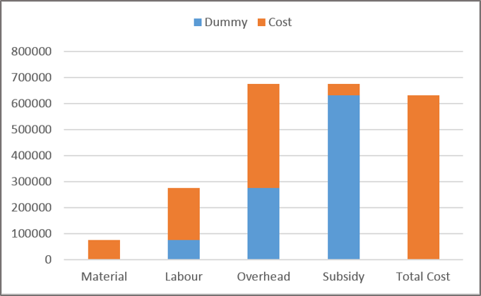
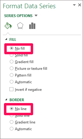
Step 5: The Blue color in the Stacked Column is the dummy pillar which we need to format.
Select the blue color column. Right-click and select format data series. Click on No Fill and No border option in the fill and border option respectively.
Step 6: We see that the start and the end column are not floating.
Step 7: We will highlight the Negative value as red in color. Subsidy in this case will be red in color because it is deducted from the total cost. Add data labels to the top of the column to read the chart quite easily. Right-click on the column and select Add Data Labels
Waterfall Chart Excel 2016
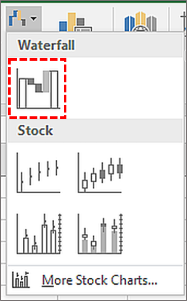
However, in Excel 2016 Waterfall chart will be directly inserted without having to carry the above steps.
Step 1: Select the data.
Step 2: Go to the Insert tab, Chart group, select the Waterfall chart.